Freelance work 2021
Client
Hvildmarken
Services
Visual identity & illustration
Credits
Strategy: Chrille Peterson, Sprint Works
Poject manager: Ellinor Hellberg & Karin Fröderberg, Honst
Photography: Linnéa Westergren, Honst
Freelance work 2021
Client
Hvildmarken
Services
Visual identity & illustration
Credits
Strategy: Chrille Peterson, Sprint Works
Poject manager: Ellinor Hellberg & Karin Fröderberg, Honst
Photography: Linnéa Westergren, Honst
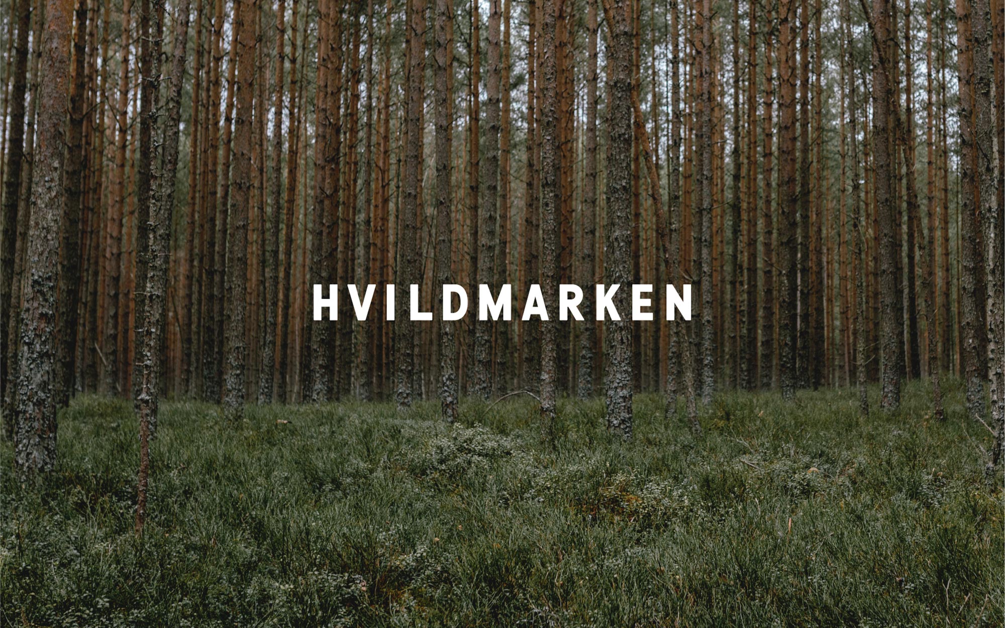
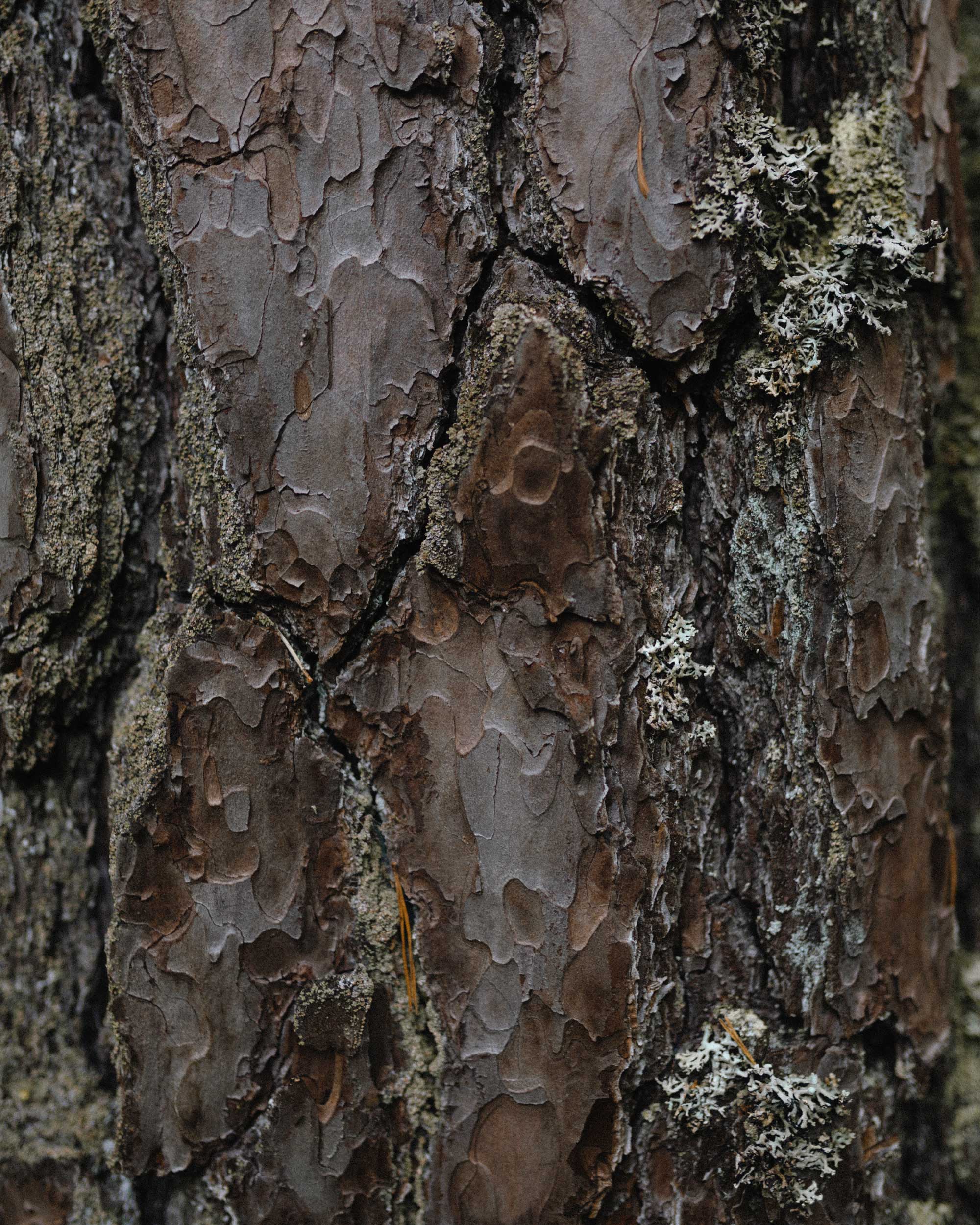
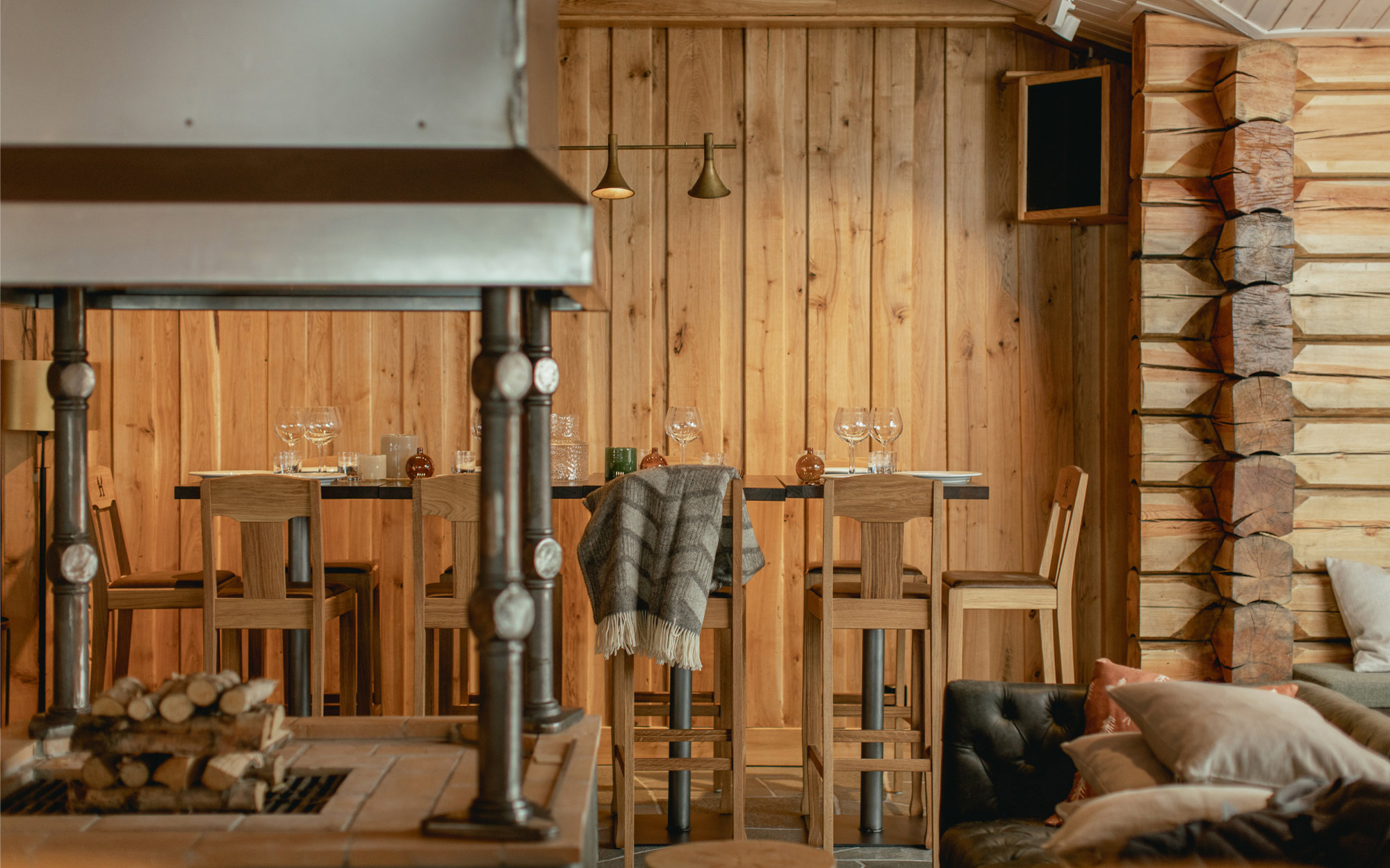
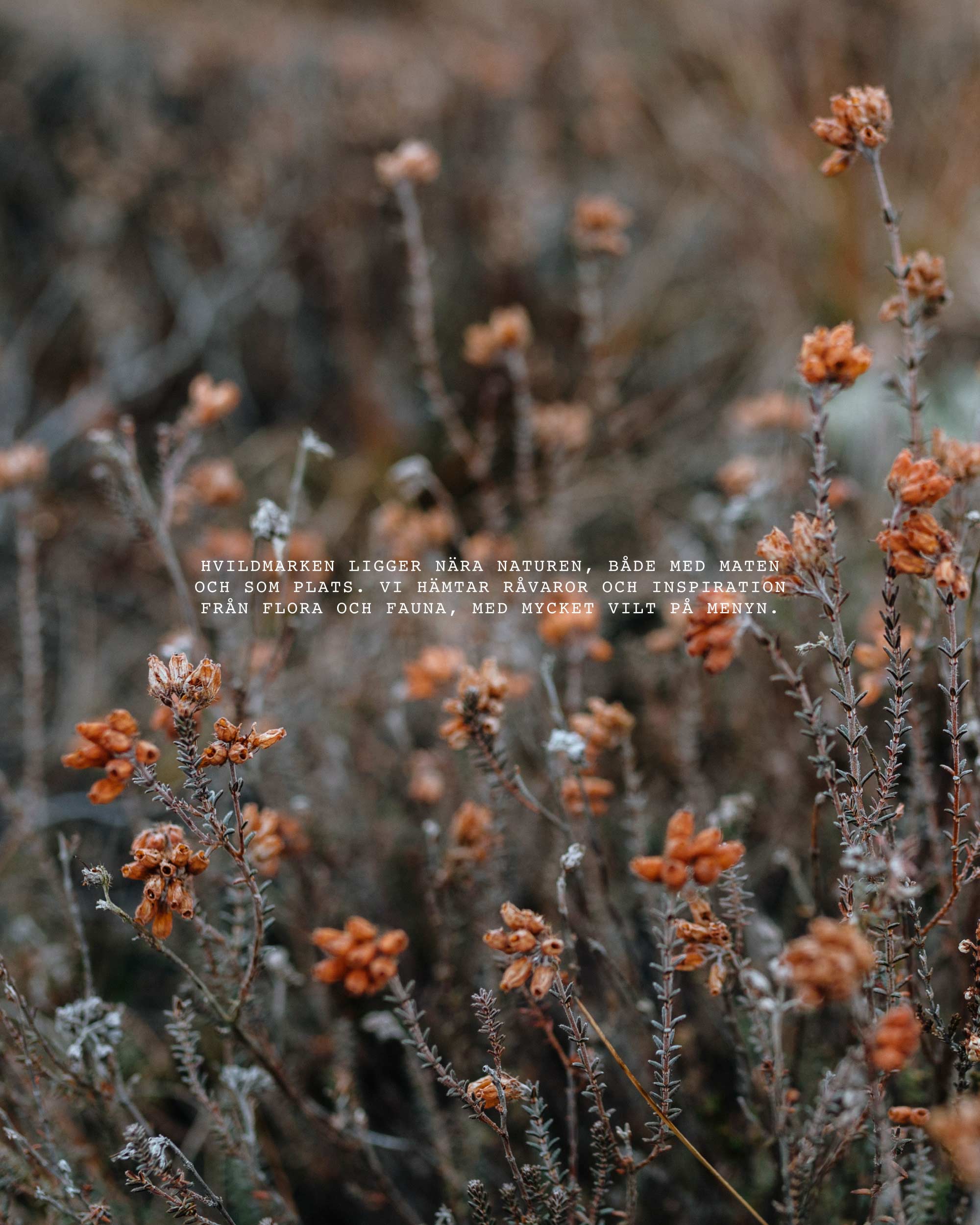
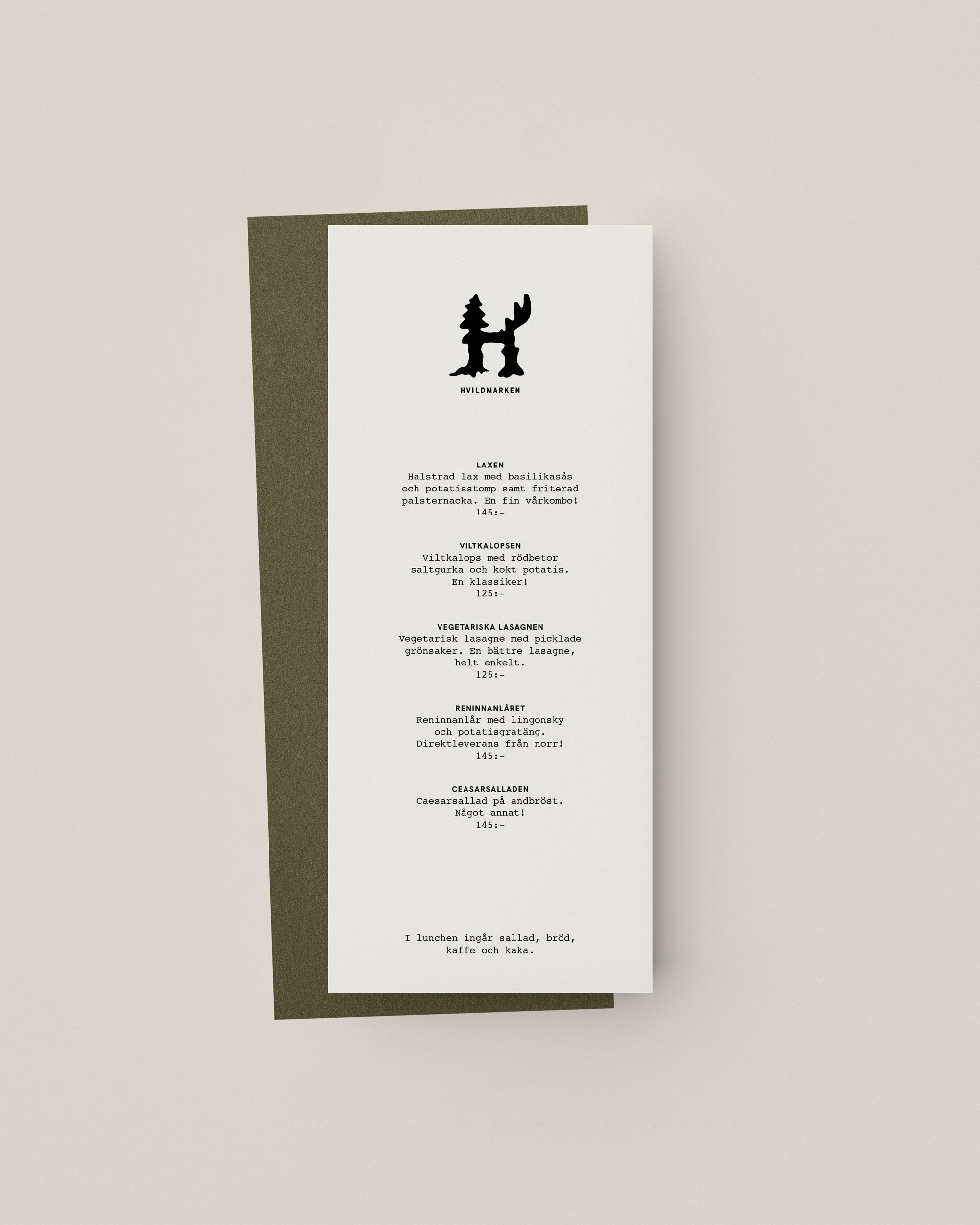
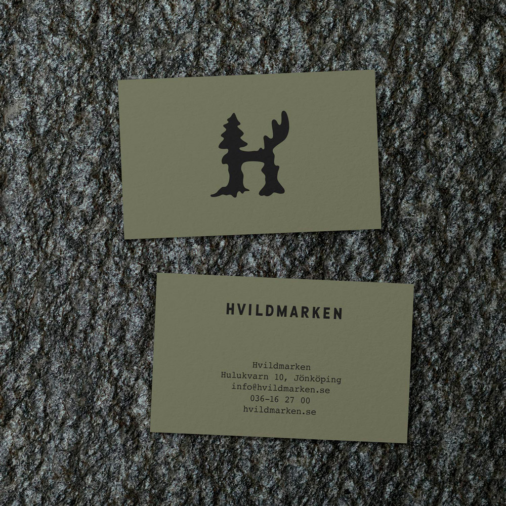
Hvildmarken is a restuarant close to nature, both food wise and as a place. The ingredients and inspiration comes from the Swedish flora and fauna. It is situated in a log house, framed by the forest, in the deep woods of Jönköping.
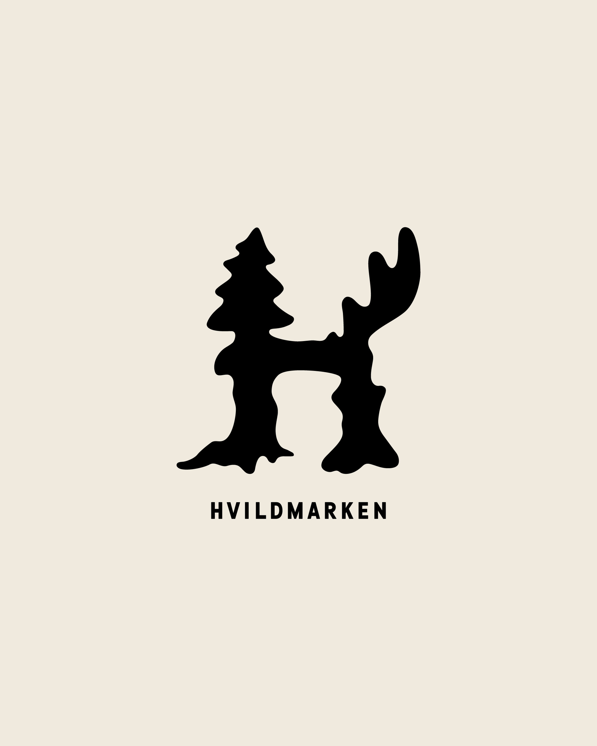
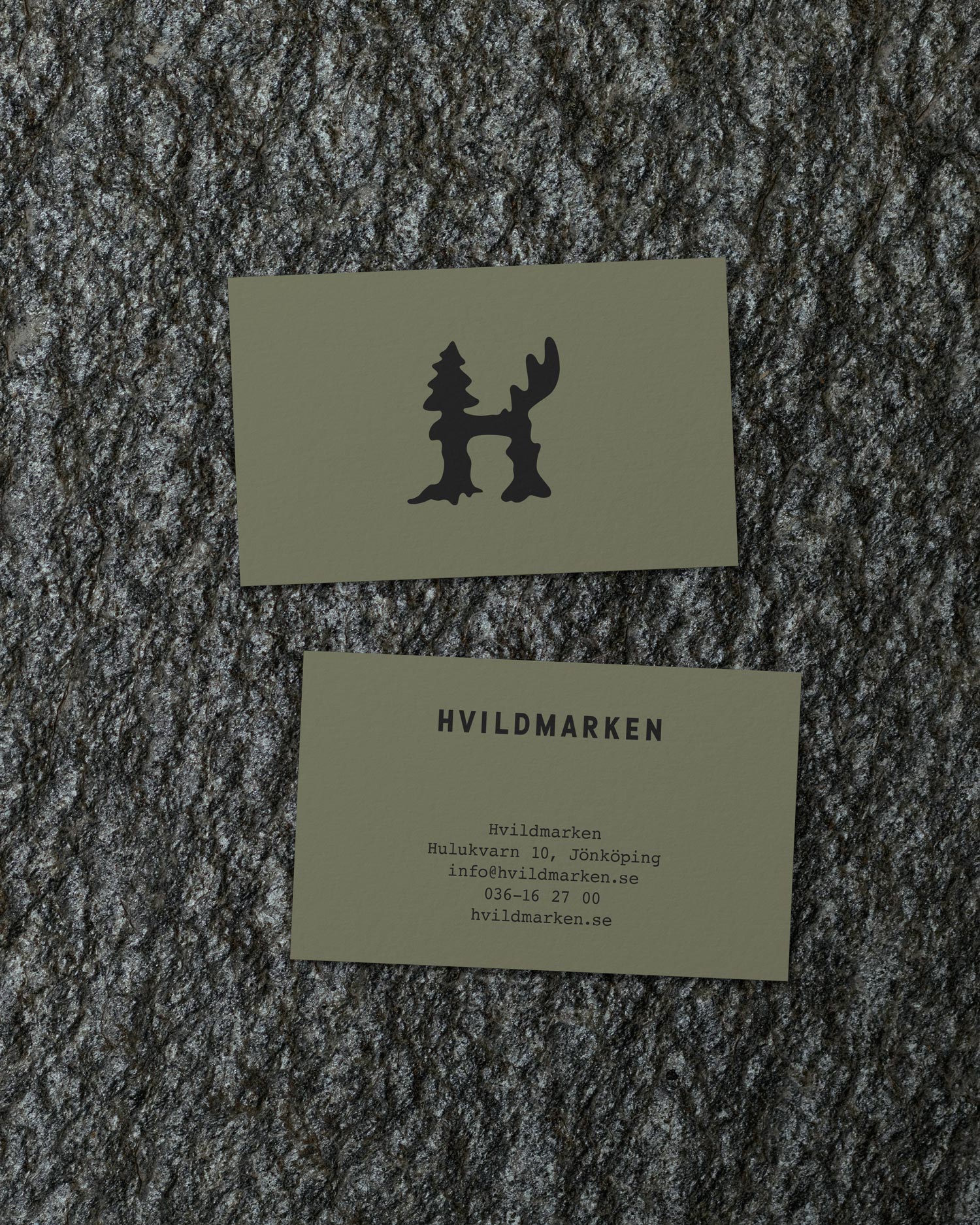
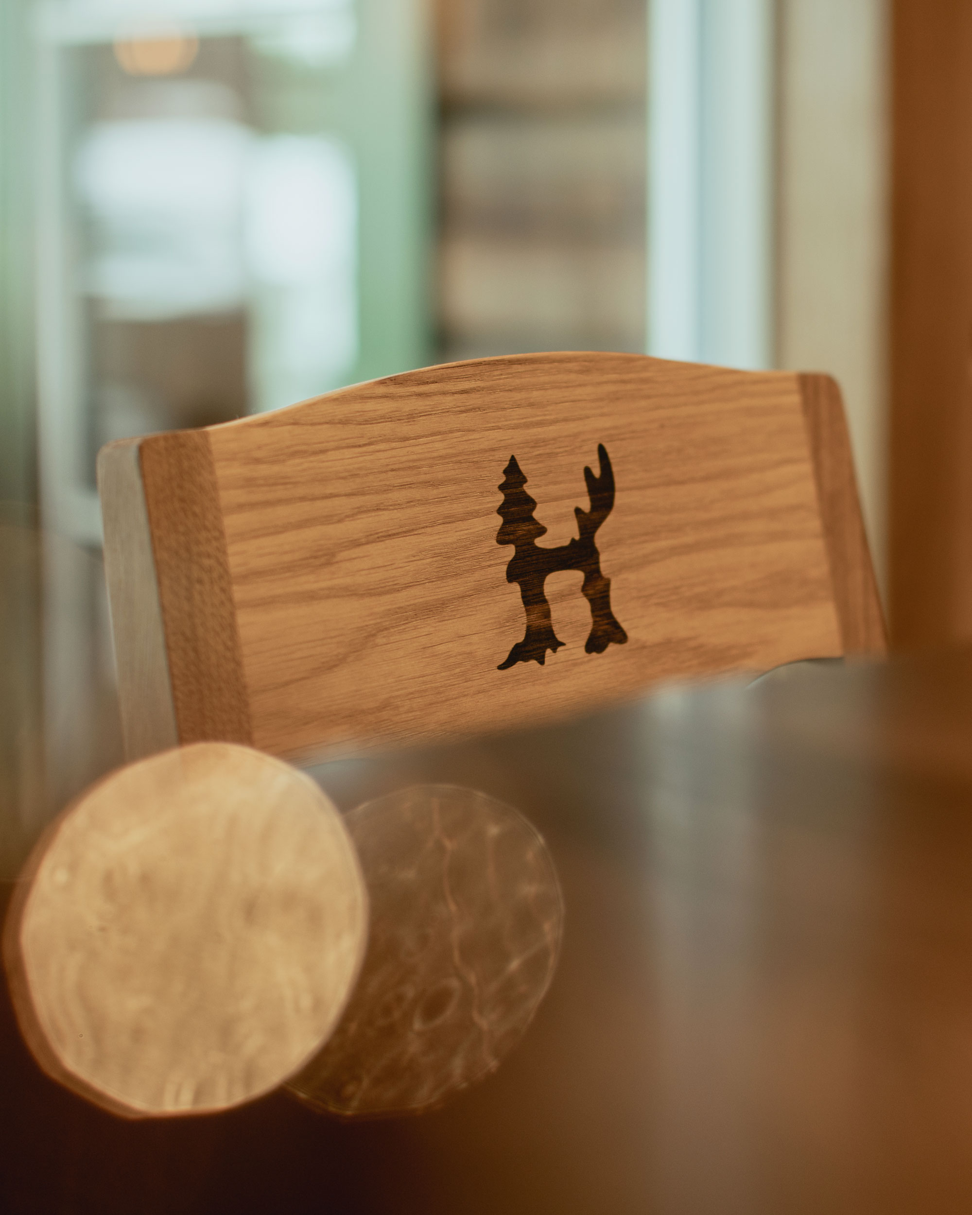
The visual identity has taken inspiration from the raw materials and the surroundings. I came up with a brand mark, which we call Hvilden. Hvilden is a hybrid of flora and fauna and acts as a mascot to represent the essence of Hvildmarken. The typography exists of organic and flourishing headlines contrasted by the classic typewriter font Courier to give that analouge, unpretentious feel. Overall, the look and feel is organic yet solid.
Hvildmarken is a restuarant close to nature, both food wise and as a place. The ingredients and inspiration comes from the Swedish flora and fauna. It is situated in a log house, framed by the forest, in the deep woods of Jönköping.
The visual identity has taken inspiration from the raw materials and the surroundings. I came up with a brand mark, which we call Hvilden. Hvilden is a hybrid of flora and fauna and acts as a mascot to represent the essence of Hvildmarken. The typography exists of organic and flourishing headlines contrasted by the classic typewriter font Courier to give that analouge, unpretentious feel. Overall, the look and feel is organic yet solid.


More work
NivåVisual Identity
Beskows SymfoniPackaging design
HvildmarkenVisual identity & illustration
Beskows – Brut NaturPackaging design
Asecsillustration
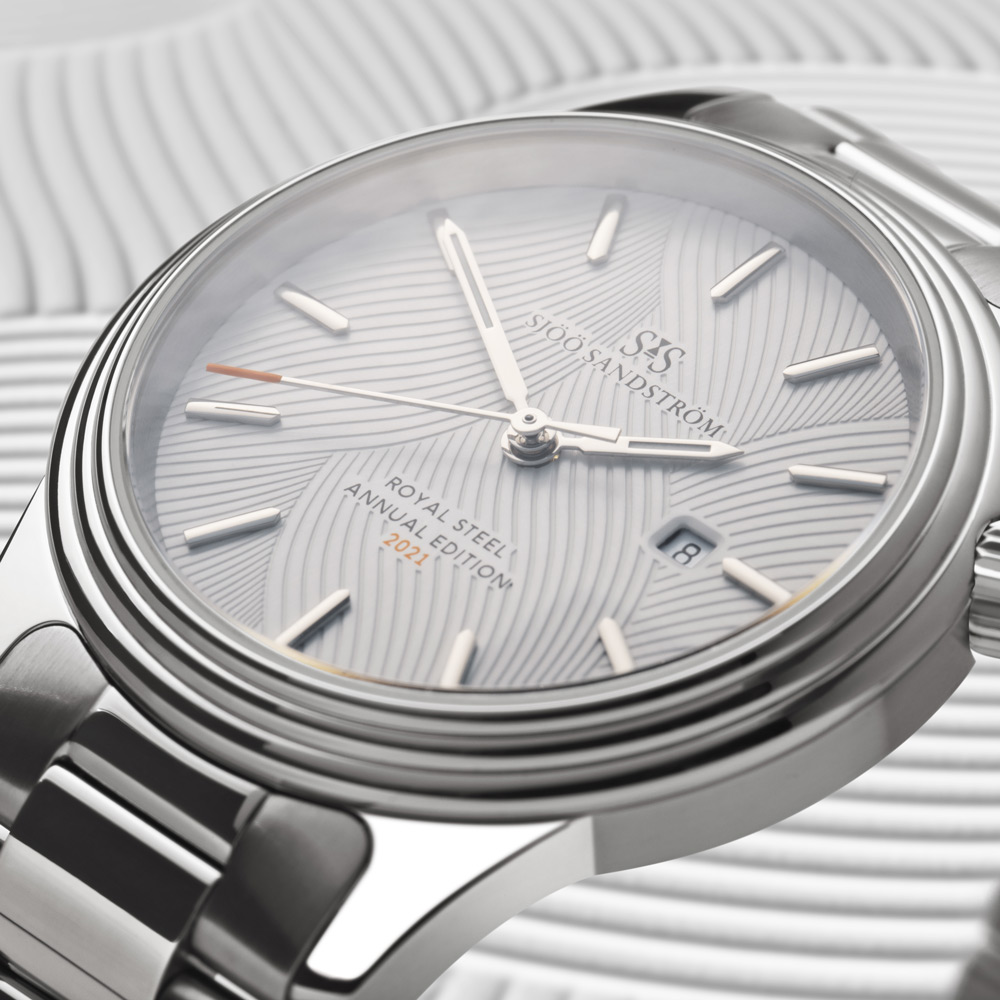
Sjöö Sandström x PippiPattern design
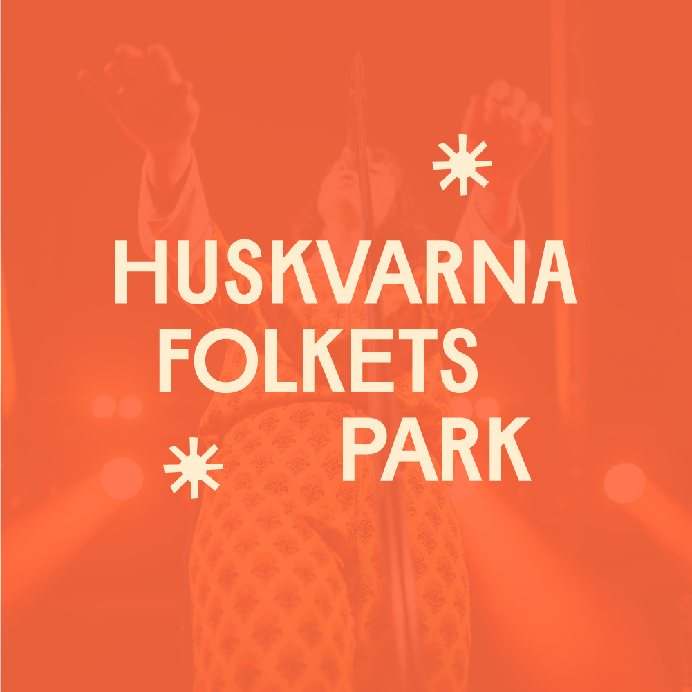
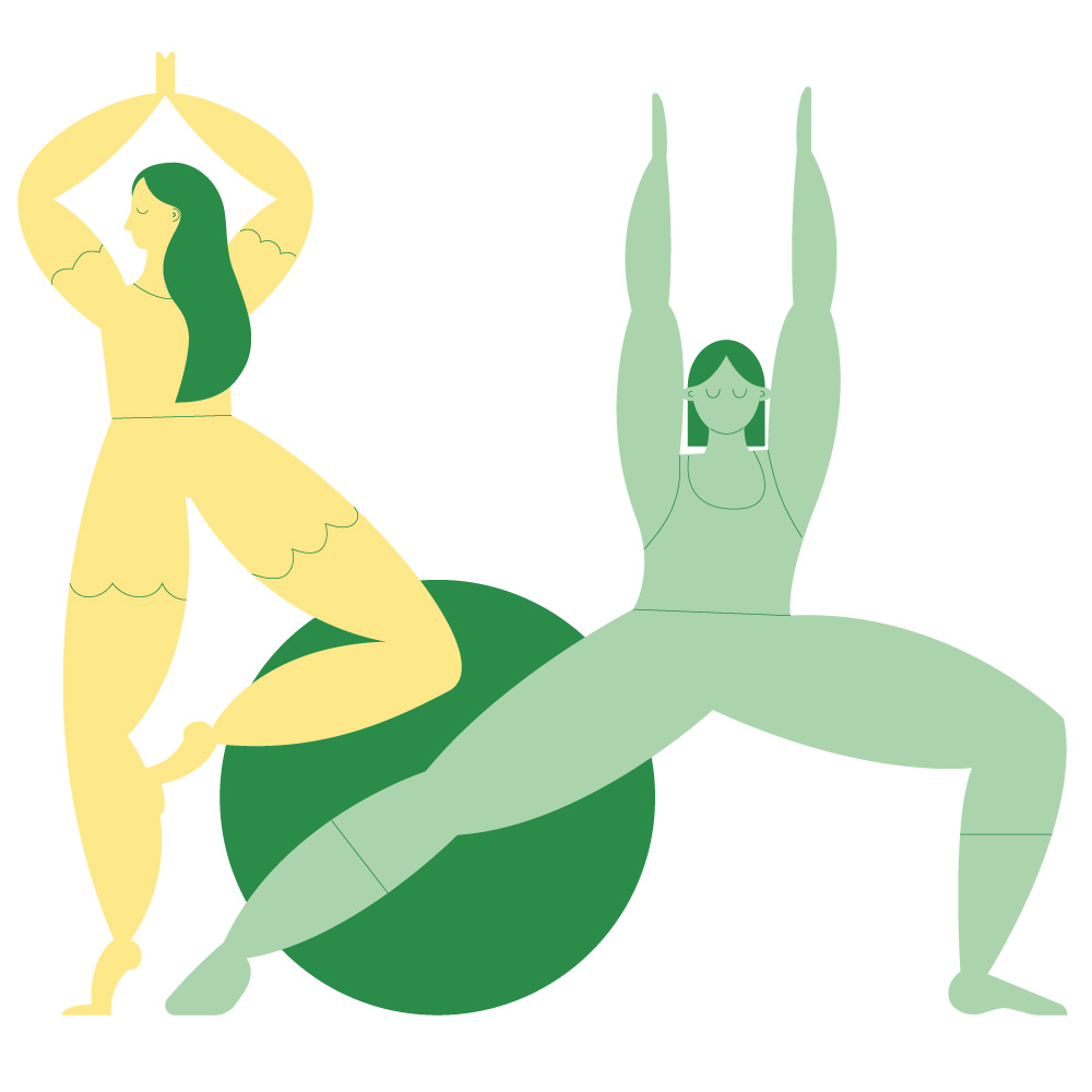
Huskvarna Folkets ParkVisual identity & illustration
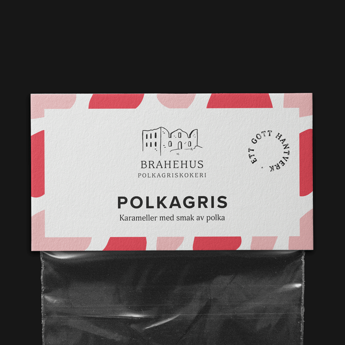
BrahehusVisual Identity, Packaging Design
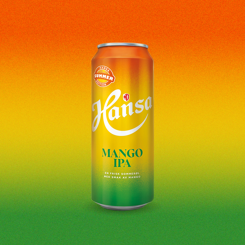
Hansa BorgArt Direction & Packaging Design

Vox HotelArt direction, Print design, Web design
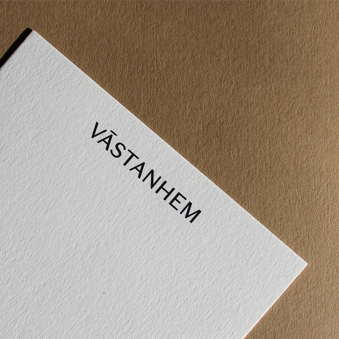
VästanhemArt direction, Visual identity, Print design
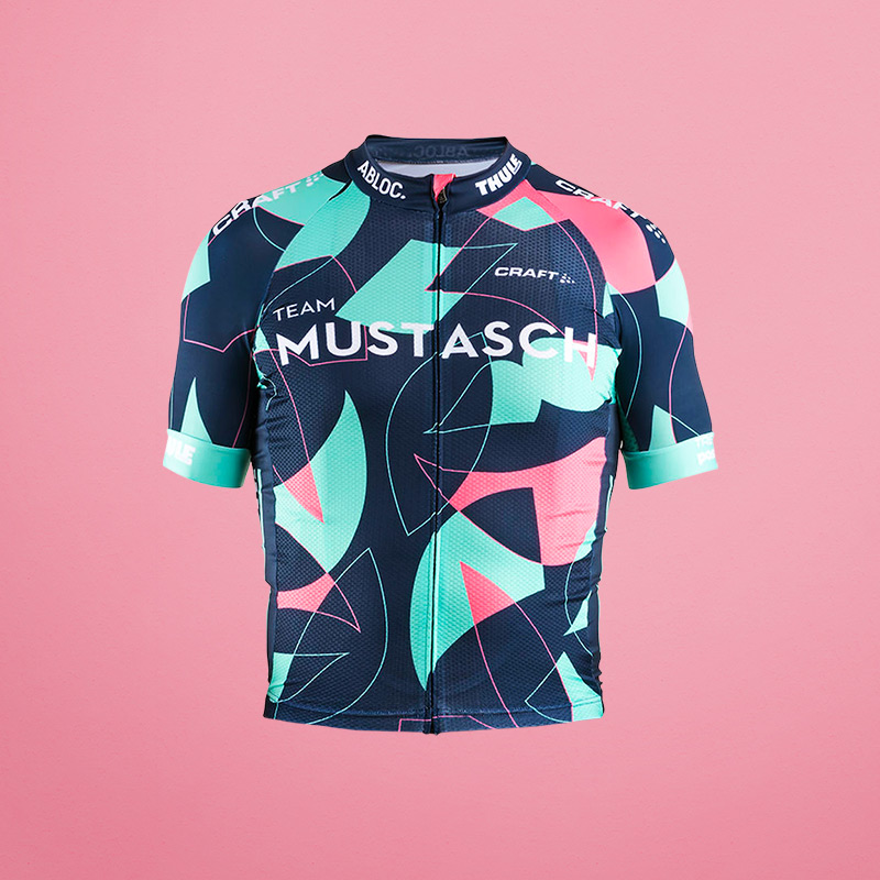
Team MustaschArt Direction, Pattern Design
Design Illustration About Shop
Caroline Franzén
hello@carolinefranzen.se
+46 709 89 22 56